
I’ll be the first to admit that I take a lot of photos that have less than perfect lighting, but through trial and error I’ve found a pretty quick and easy way to salvage these imperfect photos using a few simple Photoshop tricks.
As you can see, the starting photo is very dark. I want to brighten the whole photo and bring out the color of the flowers.
Adjust the Curves
To start, open the Curves Editor by pressing Ctrl+M

Pull the top right point of the graph over to the left a bit, then place a point in the middle and pull that up to create a rounded curve. This will significantly lighten the entire photo.
Note: By pulling the top right point to the left you are essentially losing color information, so it’s important not to pull it too far to the left or the photo will have a noticeable lack of detail in the white areas of the photo.

Change the Channel drop down to Red and pull up the middle just a bit.
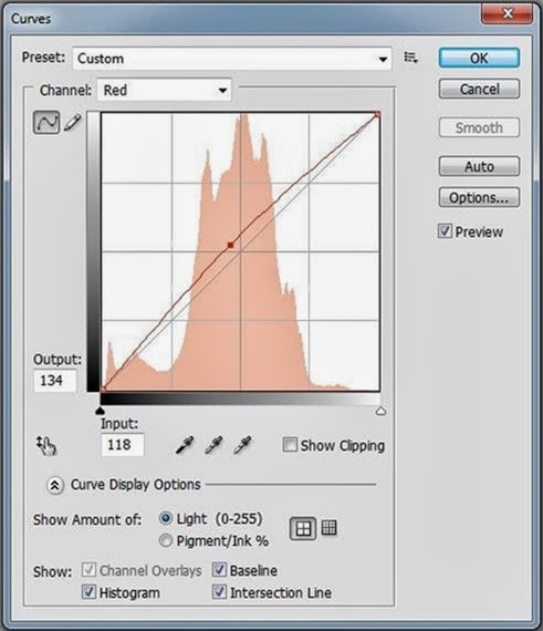
Now change the Channel drop down to Blue and lower the middle a bit. This will give the photo a warmer (yellow) tone. This might not be something you’ll want to do for every photo, but I use it a lot because I just really like the way warm toned photos look as opposed to cool toned photos.
 Adjust the Saturation
The last adjustment I made in my flower photo example is to adjust the saturation level. This is also something I don’t use on every photo, but it can be fun to play around with.
Open the Hue/Saturation Editor by hitting Ctrl+U. In the drop down where it says Master, change that to Reds and increase the saturation by about +4.

Then change the drop down to Yellows and increase the saturation by about +5.

What makes this different from the Curves adjustment we did earlier is that instead of affecting the entire photo, we are now just focusing on specific red and yellow areas.
I chose to increase the red and yellow saturation because I wanted to bring out the colors of the flowers a little bit more. Depending on the content of the photo you’re working on, you may want to increase or decrease the saturation of other hues in the photo.

And that’s it! Just a few quick adjustments and you’ve got a vastly improved photo.


